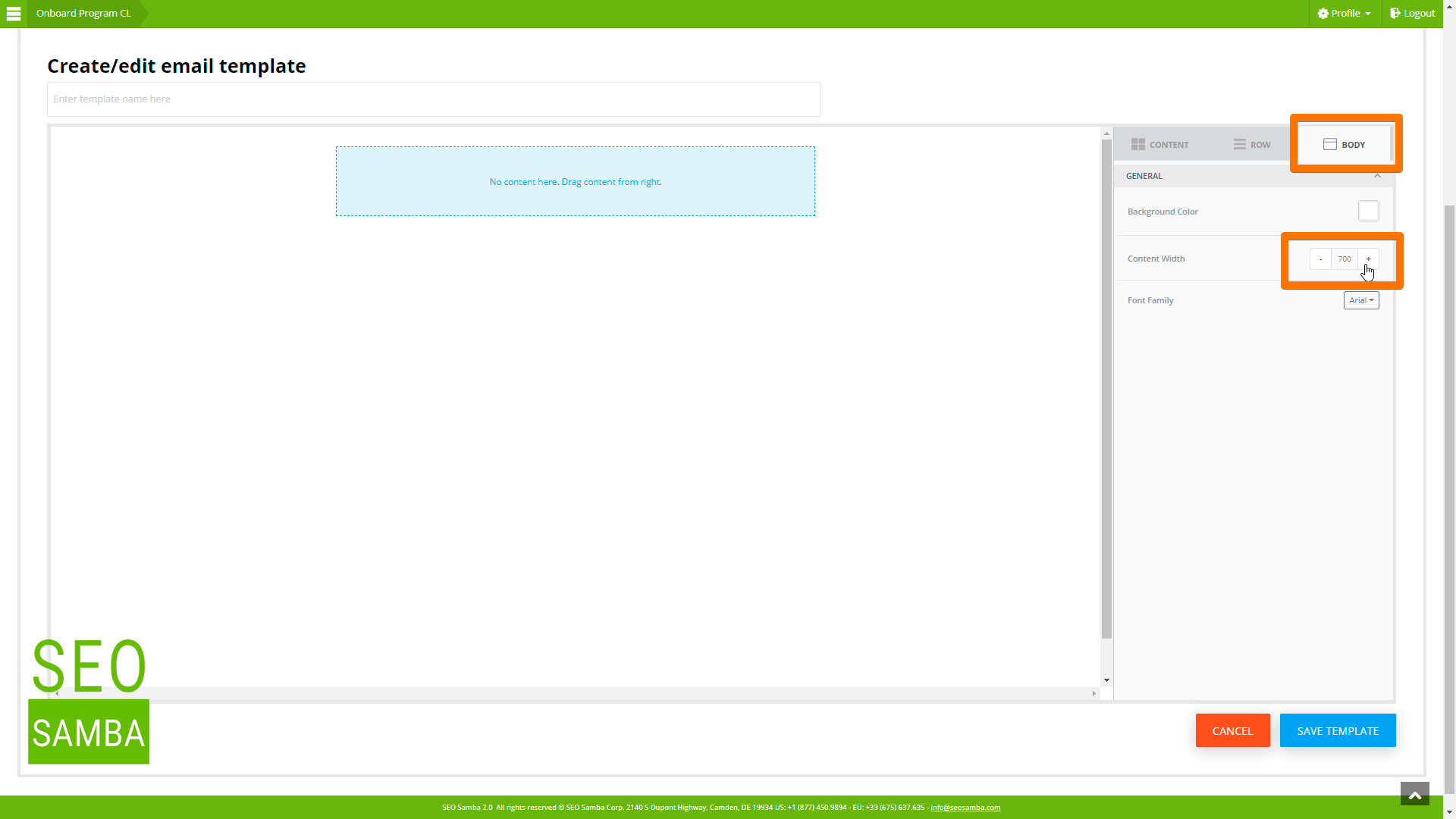
Design professional email marketing campaigns with ease. No technical skills required. Send responsive emails that adapt to the size of your reader's screen. You can also preview how your email design will look on different device screens directly from the email design tool. Now, if you want to create your own templates or further customize your communications, you just need to know one thing: SeoSamba Email Editor is layout driven. Layouts are preset so that your blog post and emails used best practices, and always look great on both desktops and mobile devices.
Now to use the editor to build a custom template or email, just follow these steps:
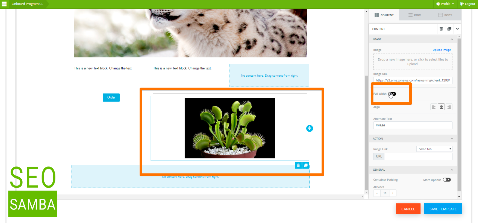
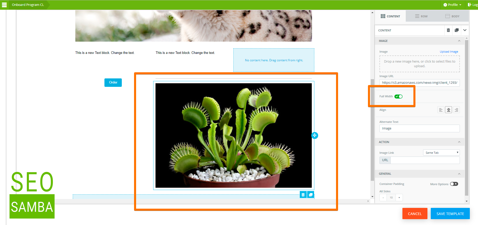
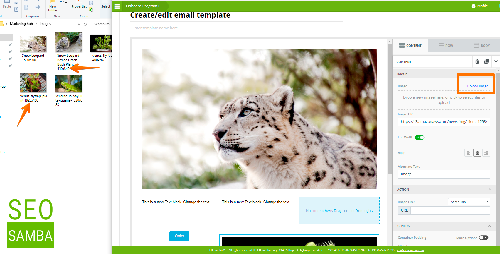
So if you upload a larger image than the available width, it will automatically get resized using the maximum cell width while retaining the image aspect ratio.
If you insert a smaller picture, or just a few words or a small button, for instance, you will be able to move that content to the right-end or left-end side, top or bottom of that cell. You will be able to remove padding between that cell and cells next to it, and stack other elements up and down in that cell as needed.
You will also be able to enlarge that content to take up all the available width in that space by either flipping a switch for images or increase font size for your copy or buttons labels.
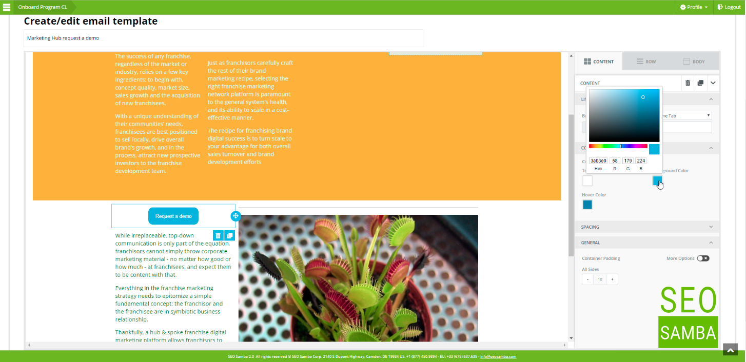
Now, this leads us to the 2nd most important point, and that is that if you work with images, make sure to upload images that are wide enough for the content area you want to position them in or with a sufficiently high resolution, so that if you intent blow them up to take the entire cell, it will still look good when you do so.
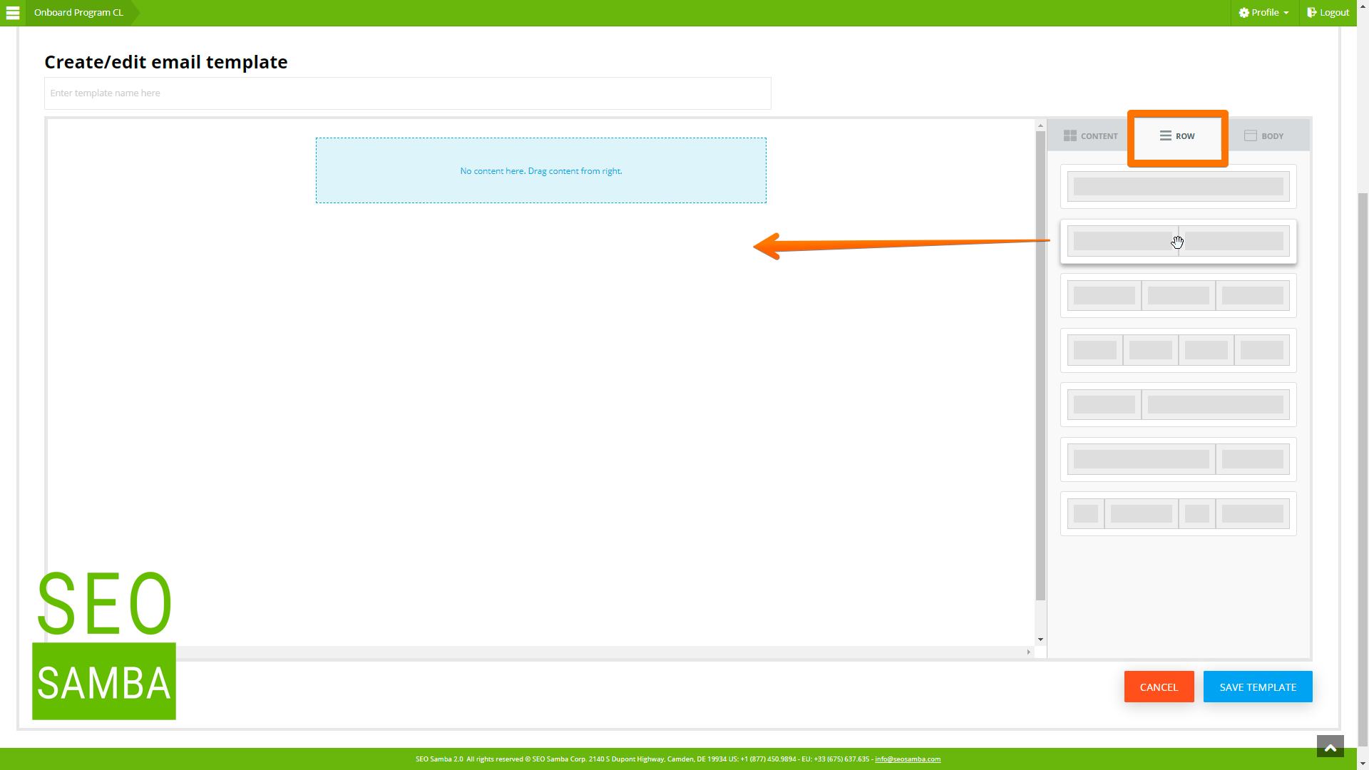
The third and last thing to know is that if as we’ve just seen, you can stack up and down as many content containers as you wish in each cell, you can’t however place content containers side by side.
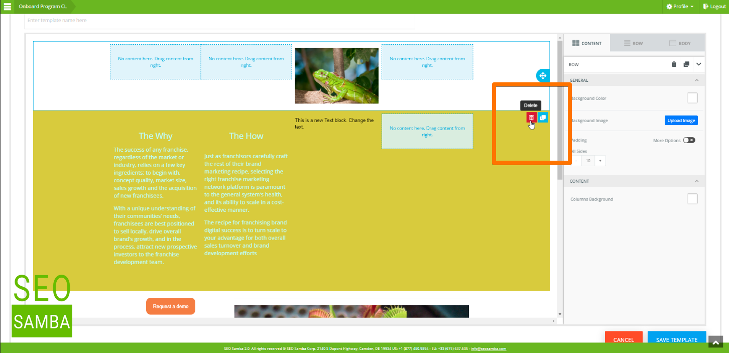
This is what the layout with columns are for. So instead, you need to insert a row with the appropriate number of columns, featuring a width that will work nicely for the content you wish to present. Let’s take a look again at these available rows format. Let’s add all the 2 and 4 columns rows so we can look together at their differences.
Keep in mind you can use the various padding and alignment options to make your communications look perfect. Of course, layout tables do not show up in your final emails or blog posts, unless you decide to use a background colour or image.
Now, if in the middle of the creative process you figure that you wish to do something different than what you originally had in mind, you can easily add a different row type to your existing layout and move your content over from one row to the other.
 sales:
  sales: